The official MTA app is disappointing - but here's how to get it back on track
The goal of a quality all-in-one navigation and trip-planning app from New York's Metropolitan Transportation Authority is a worthy one. Here's how to actually achieve it.
On August 8 of last year, the Metropolitan Transportation Authority (MTA) announced its new, self-titled mobile app. One of the biggest motivations for this new MTA app was to consolidate a number of smaller apps and services into one for a more cohesive user experience for trip-planning across MTA services. Expectations for the new app were high: the MTA TrainTime app, which is used for ticketing on Metro-North Railroad and Long Island Rail Road trains, was a smash hit with users, being praised for its simplistic user interface (UI) yet rich feature set.1 Could the official MTA app live up to this hype?
Having used the the Official MTA App for well over a year–at first as a beta tester in TestFlight, and now as a general user–I know well that app has a lot of room for improvement.2 It has an uninspired user flow, a design that does not understand its place within the transit app ecosystem, and a failure to bring real value to users.
Within this design case study, I will outline how the MTA can both fix its current mobile application and also expand its functionality to best serve the transportation needs in the New York City metropolitan area.
The Issues
The MTA’s new app suffers from three key issues:
First, the design is too complicated and overloads the user with too much information.3 Users should not be overwhelmed when trying to ascertain basic information about their rides.
Second, the MTA app fails to consider its place among other transit apps. In other words, why should someone go out of their way to install and use the MTA app instead of just using Apple Maps or Google Maps?
Third, the all-in-one app does not incorporate functionality that contemporary users have come to expect, such as Home Screen widgets or Live Activities on iPhone. These do not just rob users of useful features, but also overlook potential avenues for monetization.
Here’s how I propose fixing each issue.
Less is more
“Overchoice” is a psychological circumstance in which the abundance of options results in inefficient decision-making. The irony of overchoice is that when asked, people nearly unanimously prefer having more options as opposed to fewer. App design can accommodate for this while providing a multitude of features and functionality – without displaying all of it at the same time.
Upon first opening the MTA app, users are brought to the Explore page. Here, they can see bus stops, subway stations, train stations nearby; if users tap to the Favorites tab, they are able to see transit lines or stations that they have added to their list of favorites. There is a search bar at the top of the screen in which users can enter a station or bus stop, a line, or an address.
The Explore tab also contains a map, on which users are intended to, as the name suggests, explore the area. There is a small pink circle that stays fixed in the middle of the map; as users move around the map, information will be provided for whatever service the pink circle touches. For example, if I drag the map so the pink dot touches a nearby bus stop, I will see upcoming arrival times. While some apps have implemented this functionality well–such as Sunny Ng’s excellent The Weekendest app for iOS–I question whether this particular user flow resonates with less tech-savvy riders.4
The crucial flaw with the Explore tab is that bus stops and train stations listed here simply provide users with too much information that they did not actively request to see. Each bus stop and station lists the next three upcoming arrivals, how many stops away they are, their subway route or bus number, and, for buses, the current estimated occupancy. A small animation of radio waves plans on an infinite loop on each bus or train to indicate when the app is receiving live updates. It is overstimulating to say the least.
To be clear: the app should include this information, but adopting progressive disclosure would make the layout more user-friendly. Furthermore, this unconsensual barrage of information means that users may often have to scroll a considerable amount to find the nearby service that they are looking for.
The second page is the Plan Trip page, which presents users with two text boxes in which the point of origin and destination are to be inputted. Underneath these boxes, users can see nearby stations or stations that they have favorited. If you are experiencing déjà vu, you are not alone – inexplicably, both the Explore tab and also the Plan Trip tab have a search box, display nearby stations and bus stops, and favorite stations and bus stops.

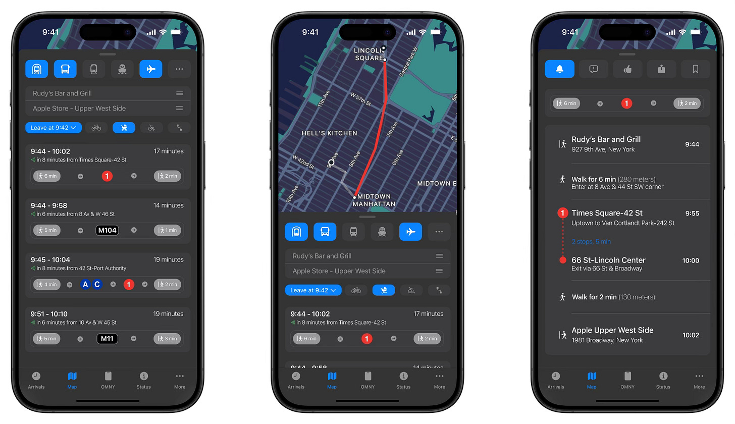
My concept reimagines the Explore tab as the Arrivals tab, with an icon of a clock for added context in the Tab Bar at the bottom.5 The layout of the Arrivals tab concept was heavily inspired by Rohan Mehta’s excellent Subway Time app, which is a single-function app dedicated almost entirely to displaying subway and bus arrival times.6 Users can tap on a given station or bus stop to see upcoming arrival times, rather than have to scroll past oodles of times for bus stops and subway stations not pertinent to them.
Under my redesign, the Plan Trip tab becomes the Map tab. In the current iteration of the app, users can explore the map on the Explore tab and plan a trip on the Plan Trip tab - but I have not discovered a good reason why map functionality should be split along these lines. The redesign employs a user experience more similar to map apps users likely already have familiarity with, such as Apple Maps or Google Maps.
The Status tab on both the current iteration of the app and my redesign are very similar. (The mockup of the reimagined Status tab can be viewed lower in the article.) However, the redesign uses larger subway bullet icons and visually-distinctive backgrounds for each section to increase readability.
Understanding context
Smartphone users’ devices almost always come with pre-installed map applications: Apple Maps on iPhones, and Google Maps on Android devices. For better or worse, this means that Apple Maps and Google Maps are the de facto baseline user experience for smartphone trip-planning and navigation. App designers who want to make transit apps for the general population need to keep this in mind throughout the development process.
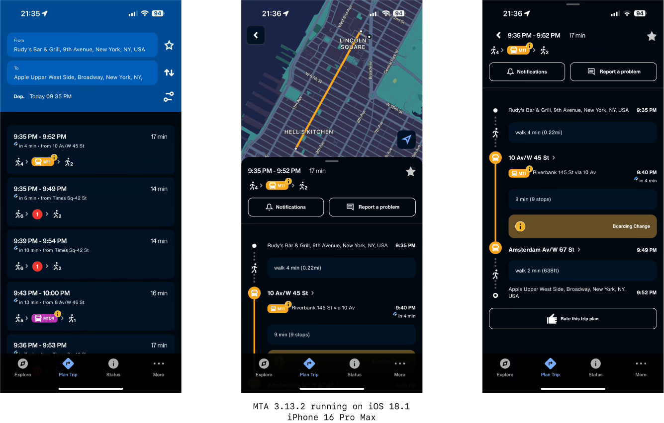
The current MTA app seems to ignore this context completely, as evidenced by its implementation of trip-planning. Aside from being visually complicated, it presents users with a directions experience different from other mainstream map apps. In my view, the biggest offense is that users are unable to view potential routes on a map unless they have already tapped on a specific route. This prevents users from being able to make quick decisions with regard to their upcoming rides.

In my redesign, users can now review potential trips without tapping on a specific route, which can save them time. It also eliminates the visual clutter for a streamlined, consistent user interface. The concept also allows users to quickly select whether they will be carrying a bicycle, have accessibility needs, or pushing a baby stroller, which would prioritize bus routes that are participating in the Open Stroller Pilot Program.
Perhaps controversially, my redesign also adds the option to export a route to a different maps app. Rather than try to pit the MTA app against more established map apps, why not give users the option to allow them to compliment each other? The MTA is a transportation authority, not a for-profit tech company - so why should it compete against those that are?
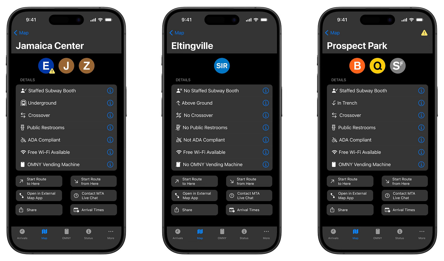
When users tap on locations in Apple Maps or Google Maps, they are presented with detailed information. When users tap on stations or bus stops in the current MTA app, they are shown upcoming arrival times, elevator and escalator outage information, and a small glyph indicating if the station is ADA compliant - and that’s all. Why not leverage MTA’s information to provide users with even more comprehensive details?7
My concept separates station information from arrival times. In addition to the currently-available information, users can now also see if a station has a staffed information booth, public restrooms, the ability to crossover to a train in the opposite direction, OMNY card vending machines, wireless internet, or whether the station is located underground, above ground, or in an outside trench.8 This layout was heavily inspired by the Kickmap app, which I have been using since 2009.9

On the plus side, the current MTA app has support not just for MTA services, but also for PATH trains and the Staten Island Ferry.10 As I have written about before, apps produced by transit authorities should strive for better interoperability, and as harsh as I may be toward the current MTA app, this is a great inclusion. To not include this information might lead some users to choose Apple Maps, Google Maps, or another app over the MTA app.

My redesign concept expands on this to feature information for nearly every transit provider in the New York City metropolitan area. In the More tab, users can hide information from transit providers that they have no interest in seeing. Pages for each transit provider can also display each provider’s mobile app to better accommodate travelers. To reiterate: the goal is more public transit ridership across the board, not for transit agencies to be needlessly territorial.
Distinguishing features
From a certain perspective, the MTA app is in a tight spot. On one hand, it should not aim to meaningfully take on Apple Maps, Google Maps, or other more-established navigation apps. On the other hand, the MTA app still needs to provide unique value to users that justifies not using another app.
In the current MTA app, tapping on the More tab brings users to the settings page. Given this, I am not sure why it is not labeled “Settings” instead of the ambiguously-titled “More.” In any case, in and of itself the More tab is inoffensive and not particularly noteworthy - but more can be done with it.

In my concept, the More tab is split into three categories: General, Visual Functionality, and Help. Settings now has its own page within the General section, along with Offline Maps and Schedules and the aforementioned External Transit Providers page. Providing users with static, offline maps and schedules is a great addition to the current iteration of the MTA app - perfect for use in underground areas of the subway that lack cell reception.
The redesign brings the MTA Live Chat into the official MTA app, which is currently only available through WhatsApp. There is also no good reason why users should be forced to leave the MTA ecosystem to ask questions or report issues.
My concept also introduces Live Activities for train or bus arrivals to the MTA app. This would allow users to see, in real time on their Lock Screens, how long it will take for their desired bus or train to reach the location in which they are hoping to board. This is an implementation that no major transit app currently provides - and a huge reason why people might choose to use the MTA app in lieu of more established map apps.

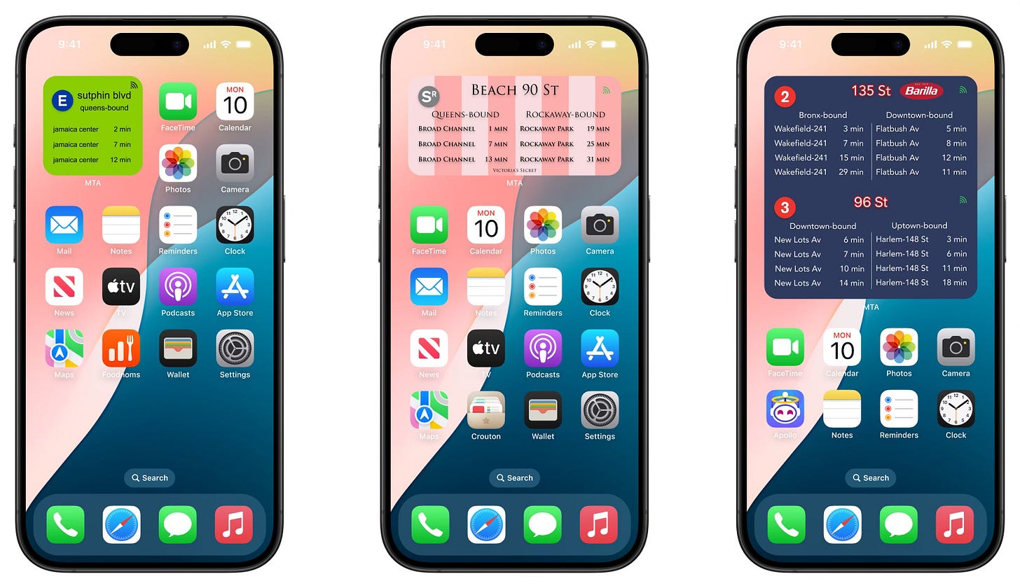
In that vein, it is past time for the MTA to start providing users the option to add widgets showing train or bus arrival times.11 Widgets are small applets that can display information at a glance on a user’s Home Screen. Imagine not needing to even open the app to be able to quickly see when the next train is arriving at your station; that’s the value of widgets.

But imagine if the MTA went beyond pre-designed widgets and instead gave users to customize the widgets’ look and feel with different colors, fonts, or backgrounds.12 While these visual styles might not look visually appealing to everyone, providing this level of customization is nearly unheard of for the app of a major transportation authority - and provides functionality that other major transit apps do not provide.

Widgets also present a potential money-making opportunity for the MTA. As branded MetroCards are being phased out, perhaps branded widgets could be a part of future paid sponsorships. Users could enjoy their favorite seeing their favorite brands on their Home Screens, advertisers would benefit from having such an intimate relationship with their audience, and the MTA could reap the rewards.
Let’s talk about OMNY
In 2019, the MTA launched its new payment system: OMNY, which stands for “One Metro New York.” This new scheme allows riders to pay using a contactless credit or debit card, digital wallets such as Apple Pay, or an OMNY card. To track rides, monitor one’s Fare Cap, or reload an OMNY card, riders can visit the OMNY website.
Since its inception, the MTA has promised to release an OMNY app to make the entire process even easier. While the release of this has been pushed back numerous times, by all accounts the MTA still fully plans to eventually launch an OMNY app. But in my view, this would be a mistake.
The MTA should not release a separate OMNY app. Instead, the functionalities of an OMNY app should be incorporated into the official MTA app.
The decision to consolidate numerous disparate apps into an all-in-one MTA solution was correct. As it stands now, directing new riders to the correct app is easy: if you need Metro-North Railroad or Long Island Rail Road tickets, use the TrainTime app, and for all other services use the MTA app. Publishing a third app would undermine this simplicity.
Very few riders want to download yet another app. Keep it simple. Integrate OMNY into the official MTA app.
Although I have been critical of the current state of the MTA app, I believe that there is great potential for it to be an incredibly welcome addition to New Yorkers’ ridership on public transportation. Eliminating visual clutter, contextualizing the app within the transit app ecosystem, and providing unique value to users are necessary steps to get the MTA app back on track.
I encourage the MTA to take revising the app seriously, integrate OMNY functionality, and generally keep up-to-date with modern technological features. As TrainTime has proven, the MTA is capable of creating genuinely excellent apps.
In the midst of completing this design case study, I saw that the New York City Subway hit its one billionth ride of 2024. Despite the challenges that public transit in New York has faced over the last few years–a global health crisis, perceptions regarding safety, the pause of congestion pricing–it is undeniable that public transportation is having a moment in the United States. Therefore, it would be a missed opportunity for the MTA to overlook the need for a significant overhaul of its much-criticized mobile app, as this could hinder the agency’s ability to truly innovate and meet the evolving needs of its riders.
TrainTime is arguably the best mobile app from a public agency I have ever used to date.
“The Official MTA App” is its full title. I am just going to call it “the MTA app” in this design case study to avoid being wordy.
The initial version of this design case study included criticism of the app that, upon reflection, was too harsh. My goal with these case studies is to provide constructive feedback, so I’ve reworded the critique to better align with that intent.
Sunny Ng is an incredibly talented software engineer, and I cannot recommend his creative offerings highly enough. He is also the mastermind behind Subwaydle, the frustrating-but-fun “Wordle” clone based on the NYC subway system.
Those who have read my other design case studies know that this is my first published work crafting an app concept in dark mode rather than in light mode. Ideally any designs of the MTA app would give users the choice between light mode, dark mode, and adhering to system preferences – which is how it currently operates.
Subway Time is my go-to solution when I want to see arrival times for trains and buses without any of the frills of a full-function app. I highly recommend it!
I have a strict “no generative AI” rule for my writing. But on this paragraph (and only this paragraph), I decided to test out the “rewrite” feature on macOS Sequoia 15.1 via Apple Intelligence. The feature worked decently well, but it misunderstood the intention of what I wanted to say, and I also went back to reword some items to match my writing voice. (I used no generative AI for any other parts of this design case study.)
Seasoned straphangers might point out that all stations have wifi. I question whether visitors or even most New Yorkers know this.
It is hard to believe that I have been using Kickmap since I first installed it on my iPhone 3GS. I seem to recall that the app used to have some sort of mini-game that was removed in later versions. Does anyone have any more information about this? Am I misremembering? Please let me know in the comments.
The Staten Island Ferry is run by the New York City Department of Transportation, and PATH trains are run by the Port Authority of New York and New Jersey.
Right before posting this design case study, I came across a TikTok video from indie developer Nick Spreen, who recently released an app putting subway arrival times in Home Screen widgets. He isn’t the first one to do this – the aforementioned Subway Time also does – but I wanted to give him a quick shout out.
I, myself, would not choose to place any of these custom widgets on my Home Screen. However, I wanted to include these eccentric designs to showcase how much customization could be possible.


