
CTrail's mobile app is outdated, confusing, and inaccessible. So I redesigned it
A case study on redesigning the iOS version of the CTrail eTix app, which provides mobile ticketing for commuter railroad service in Connecticut.
Whether to save money, save the environment, or save the frustration of traffic, public transportation is having a moment in the United States. This increase in attention comes as costs of private car ownership are rising and the federal government is spending more on mass transit - especially trains.
Last year Connecticut saw huge year-over-year increases in rail ridership.1 Unfortunately, the state’s mobile ticketing app CTrail eTix, which allows users to purchase train tickets from their smartphones, suffers from poor design. Its user experience lacks an intuitive workflow, user interface looks amateurish and outdated, and, perhaps most seriously, fails to accommodate users with accessibility needs.
I created this case study to not just encourage the improvement of CTrail, but also to push riders to demand better app support from their respective transit authorities.
What does CTrail eTix do?
CTrail eTix is a smartphone application that can be used to purchase tickets between any two CTrail stations, or between a CTrail station and a Metro-North station. This means that the app can facilitate travel between 65 different train stations across three states.
CTrail eTix can additionally reserve a paid parking spot in the Wallingford Station and Berlin Station lots. The app can also be used to check service alerts.
Design Goals
Ease of use. Whether one is a rookie rider or a seasoned straphanger, getting from points A to B on a train should be as simple as possible.
Branding. If the general public is to consider trains a modern, efficient, and generally useful transit option, then ticketing apps must reflect this.
Accessibility. Designing interfaces that understand the diversity of passengers means keeping the “public” in “public transportation”: riders who have disabilities, do not fluently speak English, or possess limited technological experience cannot be left behind.
Constraints
The goal of this redesign is to focus solely on the user interface (UI) and user experience (UX) instead of adding new features to the CTrail eTix app. While I believe that the users would benefit from adding a number of key functions, I wanted to enumerate some first steps that could be taken in improving the app. Any minor pieces of functionality added in this case study are clearly identified as such.
Introduction to Commuter Rail in Connecticut
The state of Connecticut is served by two commuter rail services: CTrail and Metro-North. CTrail, composed of the Hartford Line and Shore Line East, services 15 stations in Connecticut and one in Massachusetts. It is overseen by the Connecticut Department of Transportation (CTDOT).
Metro-North is operated by the Metropolitan Transportation Authority (MTA), controlled by New York State, and collaborates with the CTDOT on the New Haven Line. Metro-North’s New Haven Line services 39 train stations in Connecticut and 11 in New York State. Within Connecticut, three branches extend north from the shoreline to New Canaan, Danbury, and Waterbury respectively.2
On game days for the New York Yankees baseball team or New York City FC soccer team, direct service from Connecticut to an additional station–Yankee Stadium–is possible.
Amtrak, a nationwide passenger railroad system, also operates several routes throughout Connecticut, even using much of the same railroad tracks as CTrail and Metro-North. However, the ticketing systems between Amtrak and CTrail/Metro-North are incompatible.
Logging In or Signing Up
When users first download and open the current CTrail eTix app, they are met with a nondescript gray page asking for an “account name” or email address and for their password. (Strangely, users are never given the option to set up an “account name.”) Creating an account or resetting a forgotten password requires going to a separate page; this page is branded solely with the name of the company who developed the app, and with no CTrail or CTDOT messaging. (Users who attempt to reset their password will be asked for either their email address or “user name," despite never being given an option to create a “user name,” either.)
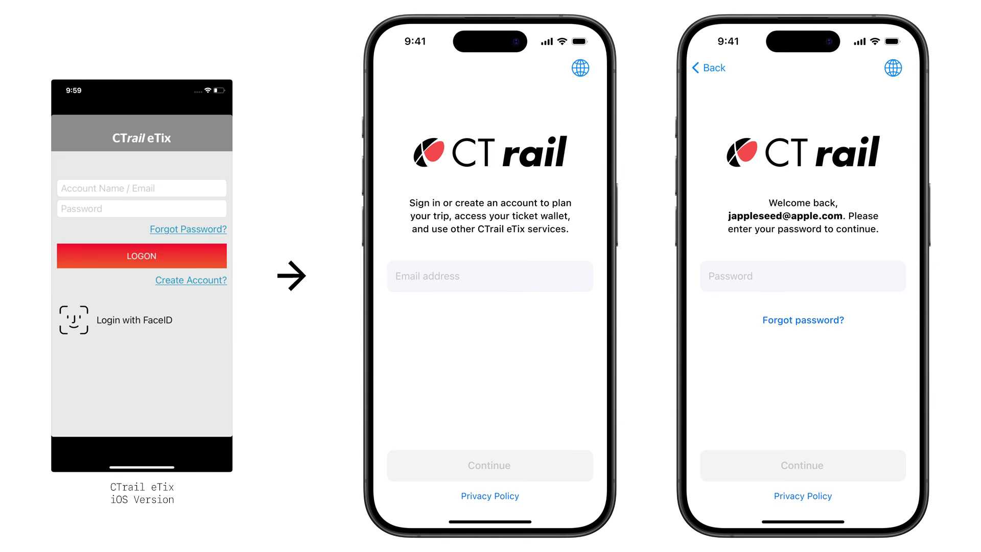
In my redesign, users are initially asked only to input their email address. Those who have preexisting accounts then will be prompted to enter their password; those who do not have an account linked to the inputted email will be able to create an account by filling out other necessary information. Users who need to reset their password are now met with a choice of either receiving a password reset email or contacting customer support. Quick access to the privacy policy has also been added at the bottom for data-conscious riders.
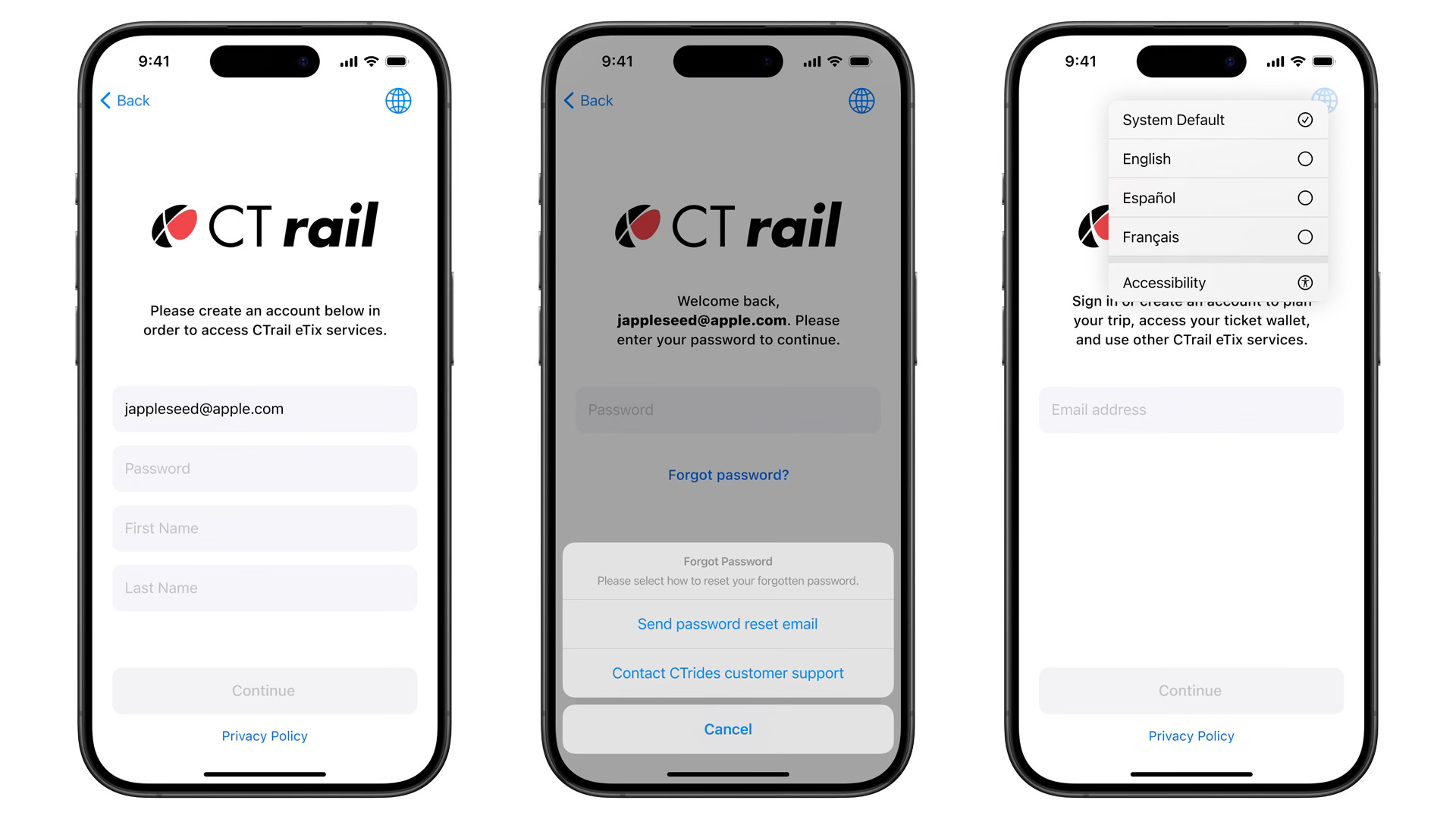
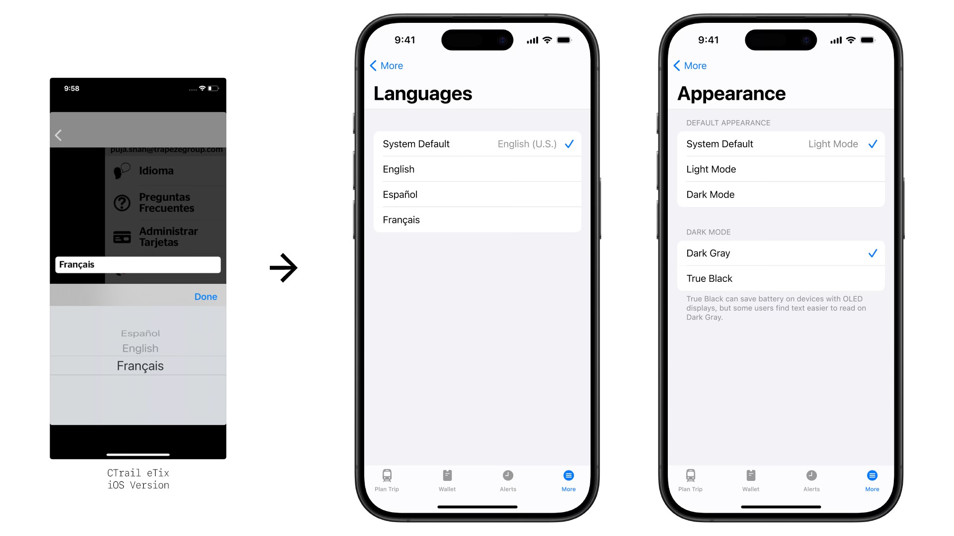
The CTrail eTix app is currently offered in English, Spanish, and French, but the current configuration of the app requires users to log in or create an account using an entirely-English interface before being able to change to their preferred language. In the redesign, users can change the language of the app before logging in, as well as have quick access to their device’s accessibility settings.
Two Caveats
For comparison’s sake I have included in this case study some screenshots from the current state of the CTrail eTix app alongside mockups from my redesign.3 Before continuing, I wanted to make two things clear about the screenshots from the current CTrail eTix app.
First, the empty spaces with black backgrounds at the top and bottom of the screen are how the current CTrail eTix app looks on any Apple iPhone with Face ID since the release of the iPhone X, which had a taller display than devices that came before it. Although the iPhone X debuted in 2017 and the CTrail eTix app was launched in 2020, the developers did not properly design the app to adapt to modern device sizes.
This dead space not just looks anachronistic but also degrades the user experience. Less available screen space means that users must spend more time swiping to access the what they need.
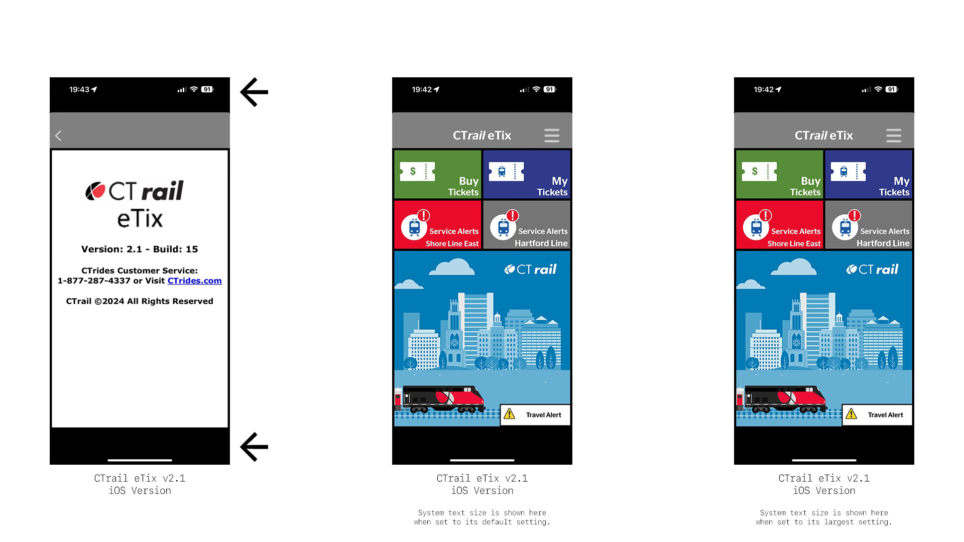
Second, in my view the most problematic aspect of the current CTrail eTix app is that it does not conform with systemwide accessibility settings. Aside from a 2022 update that included support for VoiceOver on iPhones, the app ignores most other on-device accessibility settings.
Perhaps the most egregious is that text size cannot be increased in any way, leaving those with vision impairments–especially seniors–without many options. The root of this issue is that the developers chose not to use Dynamic Type properly. From the user’s perspective, this means adjusting the text size of their device will fail to adjust the text size within the app.
I will not be specifically identifying either of these problems in every section due to their ubiquity: these two issues are consistent across virtually all parts of the current CTrail eTix app.
Trip Planning
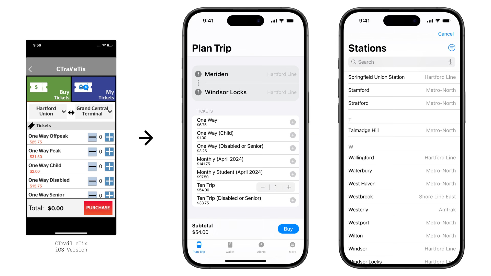
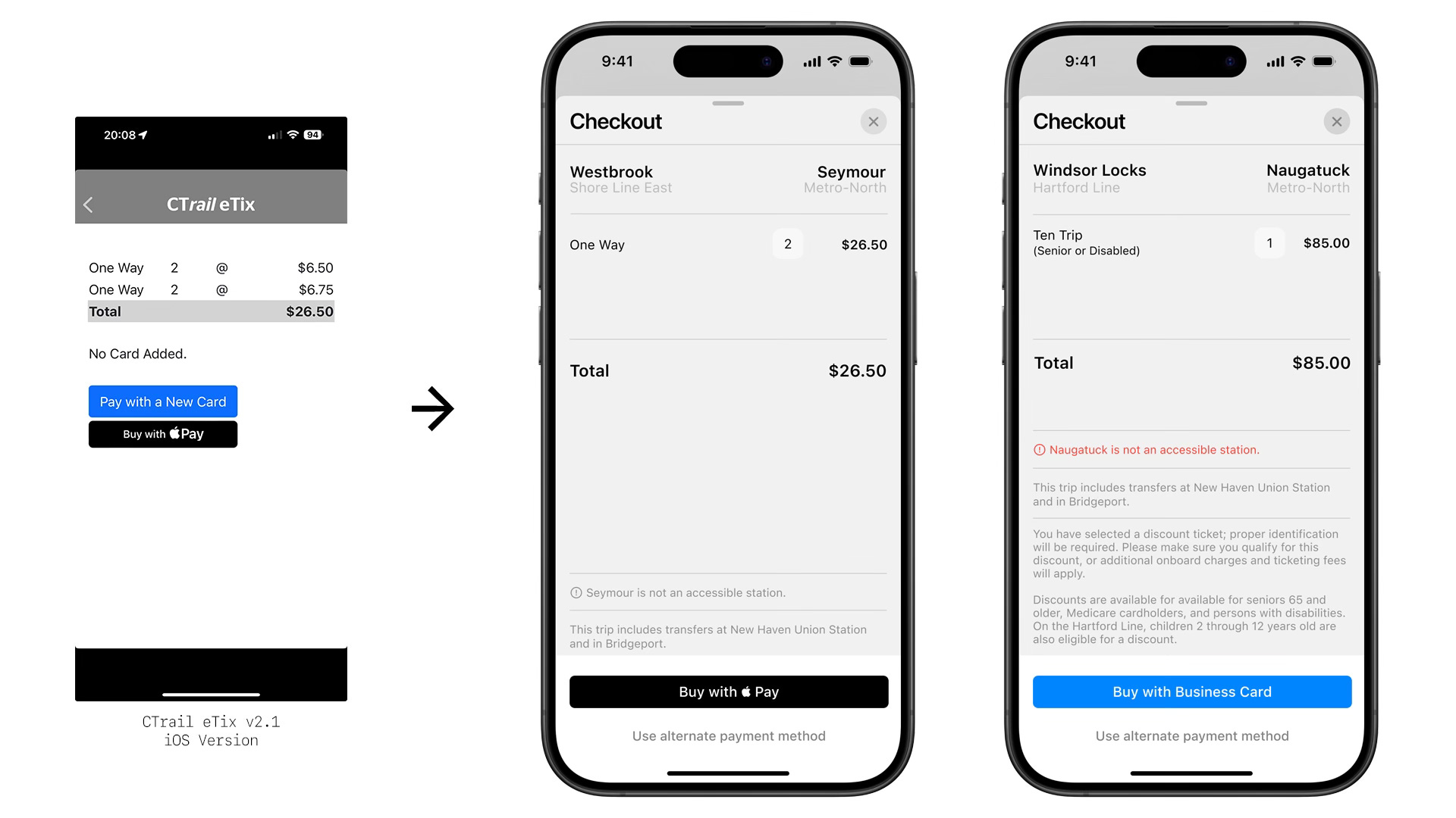
Purchasing tickets should be a straightforward process: select the station of origin, select the destination station, and then purchase the appropriate ticket. Both the current CTrail eTix app and the redesign follow this motion; however the redesign takes care to provide essential details about stations, transfer points, and potential accessibility conflicts without overwhelming the user.
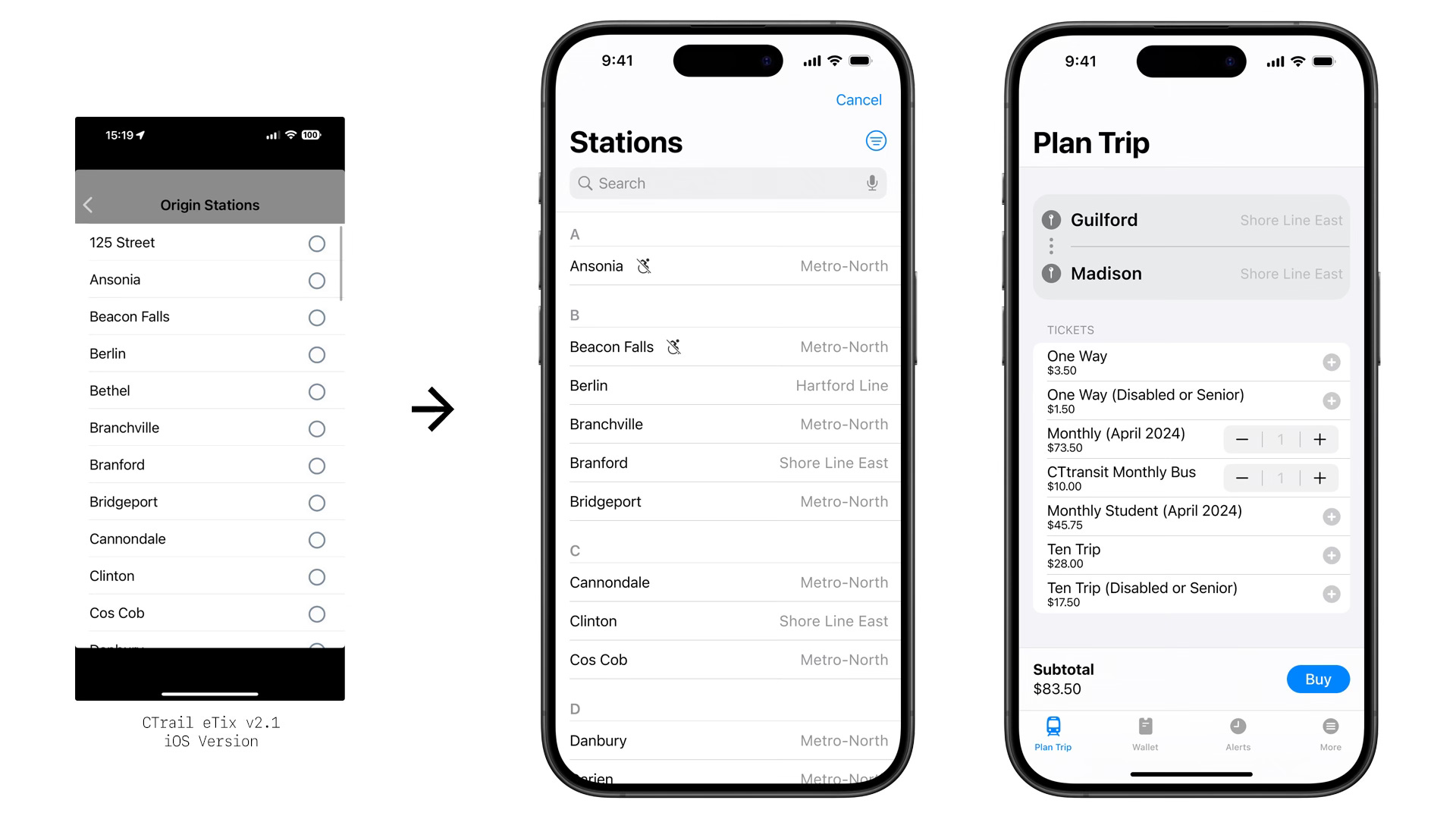
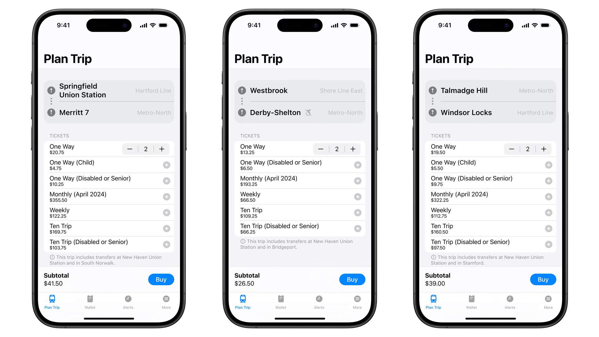
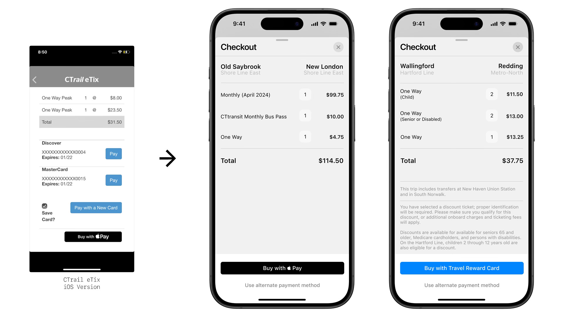
In the redesign, each station now displays which train operator services it, which can help inform riders in their trip planning. If two stations are selected that require a transfer, the page not just indicates that a transfer is needed but details the transfer points by name. By properly formatting the page to modern smartphone sizes, more information is displayed at one time without appearing cluttered.4 Information about transfers is also displayed in the checkout sheet prior to actually purchasing the tickets.
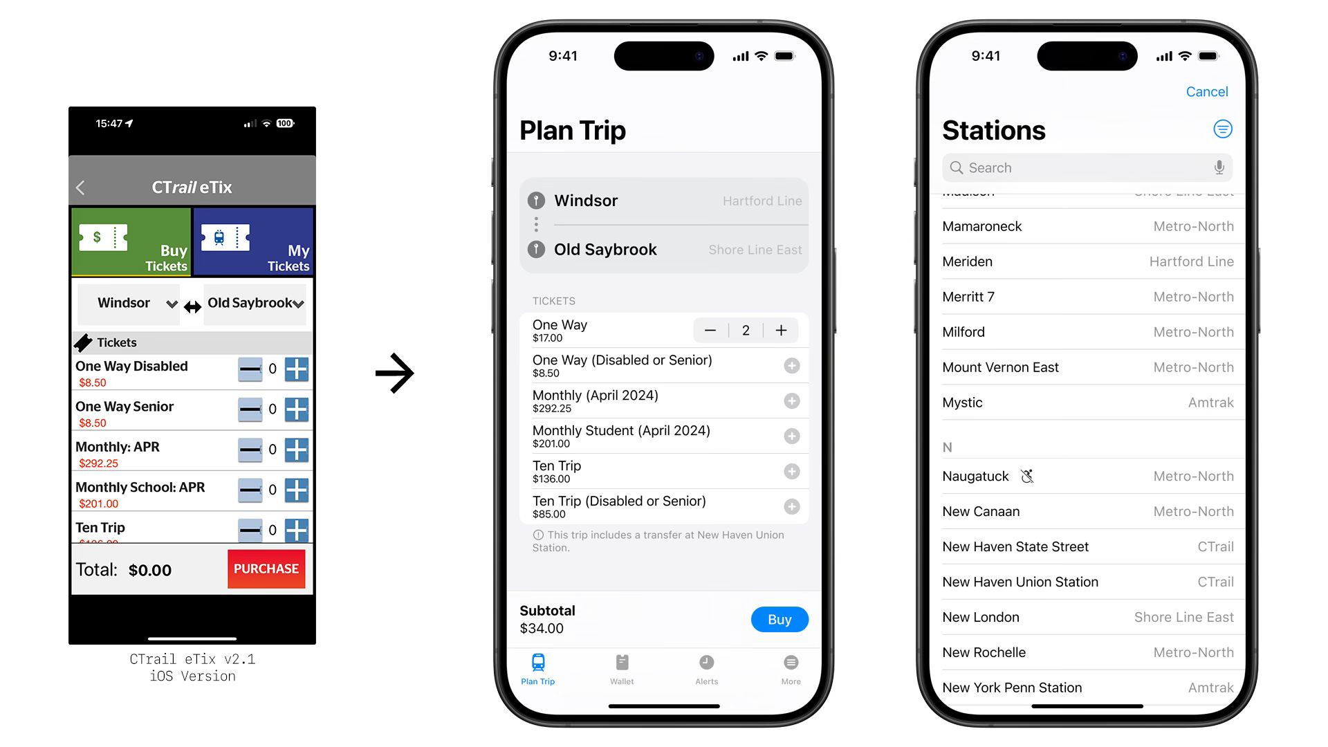
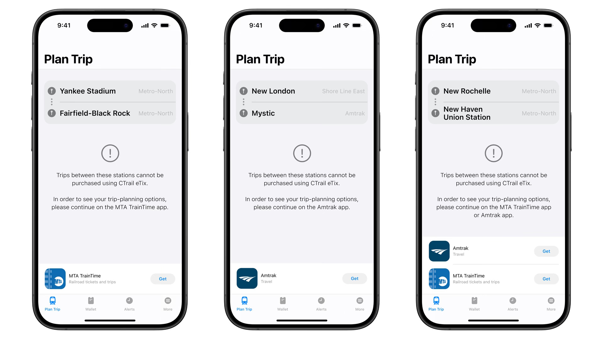
The current CTrail eTix app lists all CTrail stations, all Metro-North New Haven Line stations, and the Yankee Stadium station in the app. Users are unable to type to search for their stations, meaning that they must swipe through dozens of stations to find the one that they want, which can be tedious and error-prone.5 If a user selects a Metro-North station for their first selection, the app then hides all stations except for CTrail stations when the user goes to select their second station. The redesign rethinks these approaches.
As stated before, tickets purchased using the CTrail eTix app must have a CTrail station as either the origin or destination for the trip. However, hiding the vast majority of stations without explanation may confuse less experienced riders who do not understand the complexities of the systems. The redesign hides no stations, although users may filter stations by service operator.
The redesign also elects to add three Amtrak-exclusive stations purely for reference:
New York Penn Station: Infrequent train riders in Connecticut often confuse Penn Station and Grand Central Terminal - I can anecdotally attest to this, having fielded this question dozens of times throughout the years. This confusion is compounded by the fact that the MTA is currently planning on an eventual expansion of Metro-North into Penn Station.
Mystic Station: This is the only train station in Connecticut to not be serviced by Metro-North or CTrail, only Amtrak. Not providing reference for this station can cause confusion among locals – not to mention tourists heading into Mystic, the popularity of which has exploded in recent years thanks to social media.
Westerly Station: Although this historic station is located in the state of Rhode Island, it is only about 300 meters or 0.2 miles from the Connecticut border. It is so close that CTrail has been considering expanding service to Westerly (and Mystic).6 Furthermore, the app already provides service into Massachusetts and New York, so providing reference for trips into Rhode Island maintains consistency for eastward travelers.
Although the MTA, CTDOT, and Amtrak are three separate entities, there is no reason why each of their apps needs to pretend as if the others do not exist. If the most convenient route for a rider necessitates using a different transit authority’s app, why not make it easy for them? The redesign prioritizes getting passengers onto trains, even if through a different app.
The current CTrail eTix app does not identify the stations that are inaccessible, which may create difficulties with riders who have mobility issues. The redesign clearly and consistently identifies inaccessible stations throughout the ticket-purchasing process.7 When users are in the checkout phase of buying a ticket to or from an inaccessible station, informational text appears and warns them of this fact; if a user is attempting to purchase a discount ticket for seniors or people with disabilities to or from an inaccessible station, this warning appears in red.
Of the 65 stations featured in the current CTrail eTix app, only two have the functionality to reserve a parking spot via smartphone: Wallingford Station and Berlin Station, both of which are situated on CTrail’s Hartford Line.8 While some drivers may want this functionality expanded to more stations, this is not something that a mere app redesign alone can accomplish.
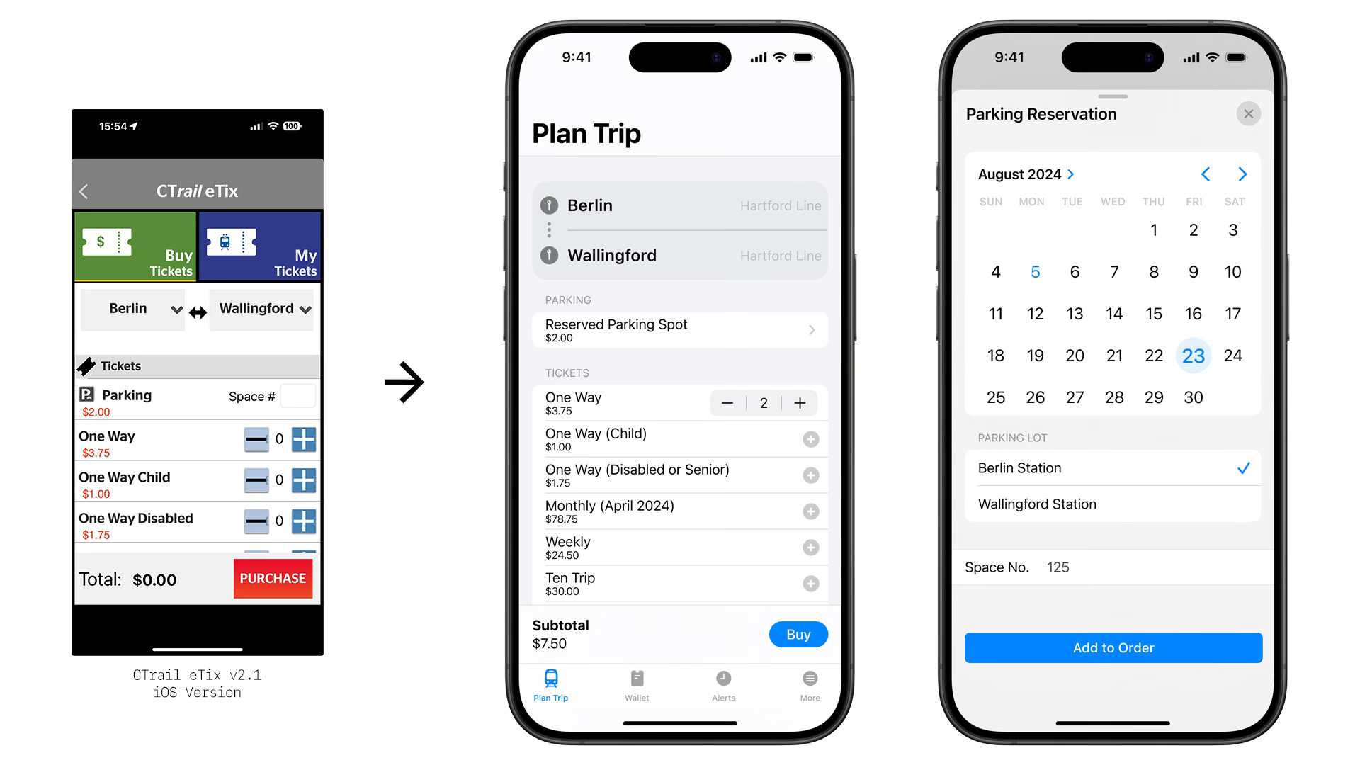
In the current CTrail eTix app, the option to reserve parking shows up when either Berlin Station or Wallingford Station is selected. To add parking to an order the user must manually enter the number which corresponds to the parking spot they wish to reserve. The app will then allow you to add to your order the parking spot reservation for the current day; there is no way for a user to select another date. If the user presses the “plus sign” button to add another parking reservation to the order, it will automatically add the same exact parking spot on the next available day; the user is unable to select a different parking spot, or to purchase reservations on non-consecutive days in the same order.
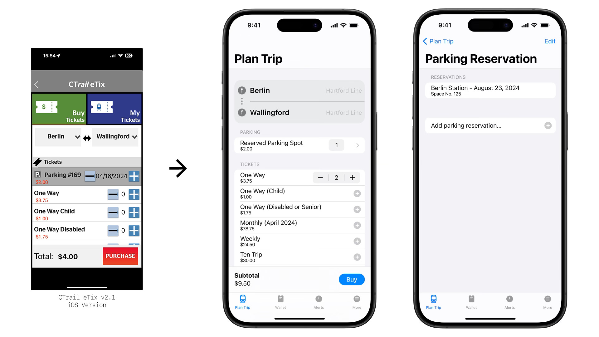
In the redesign, users are given much more control over which parking spots and on which dates they are reserving. This was achieved by adding a sheet that provides granular customizability. While I would have preferred an approach that gives the user a visual layout of the parking lot–such as within concert hall, sports stadium, or movie theater ticking apps–doing so would have been violating my self-imposed constraint on adding additional functionality.
Ticket Wallet
The main two functions of the CTrail eTix app for consumers are to purchase tickets and then be able to present them to a conductor when riding the train. The wallet is where the latter action occurs.
In the current CTrail eTix app, tickets are listed in a manner that makes information hard to decipher. The type of ticket (e.g. “Ten Trip,” “One Way”) and the number of tickets remaining are in a large text size, whereas the origin, destination, and other ticket information are all listed in a much smaller text size. The button to activate the ticket takes up about one-fifth of the space.
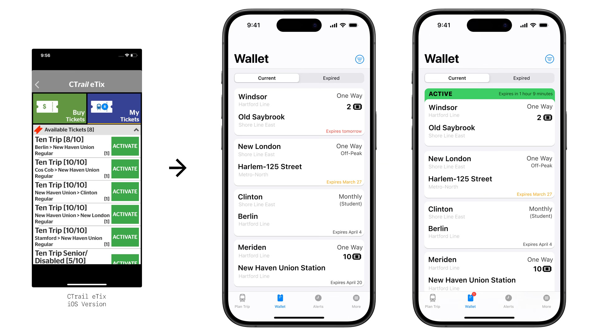
The wallet in the redesign prioritizes the origin and destination stations above all else, while also displaying the type of ticket, expiration date, number of tickets remaining, and which train operator will be servicing the trip. The expiration date changes color if a tickets’ expiration dates are coming soon. When a ticket is activated, a green band at the top of the ticket and a red notification badge appears on the Wallet icon on the tab bar.
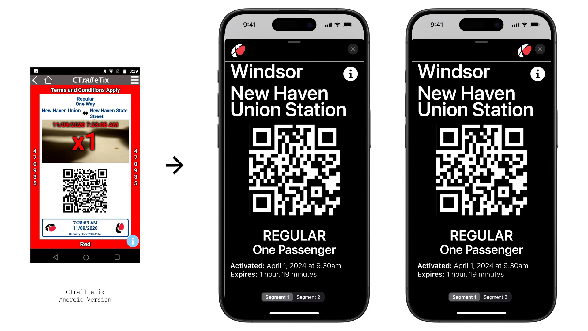
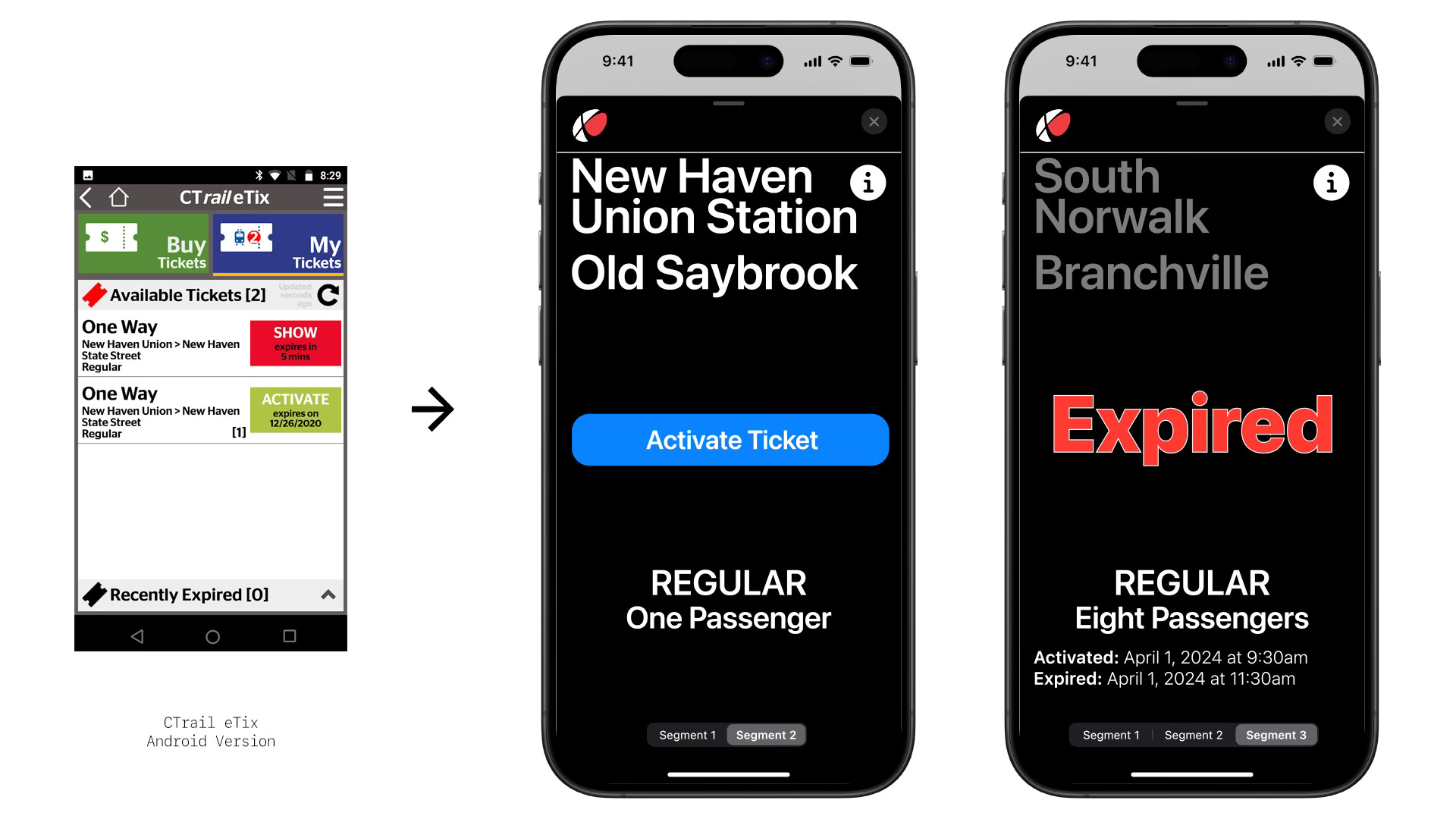
In the redesign, tickets are opened in a sheet with a pure black background. Users first open the ticket sheet and are then able to activate the ticket, reducing the chance of accidental activation. Crucial information–stations of origin and destination, ticket type, and the number of passengers–is displayed in huge letters for maximally efficient reading by the conductor. The QR code is presented as large as possible for easy scanning. In trips with two or three different segments, passengers can navigate between tickets using segmented controls that appear on the bottom of applicable trips’ ticket sheets.
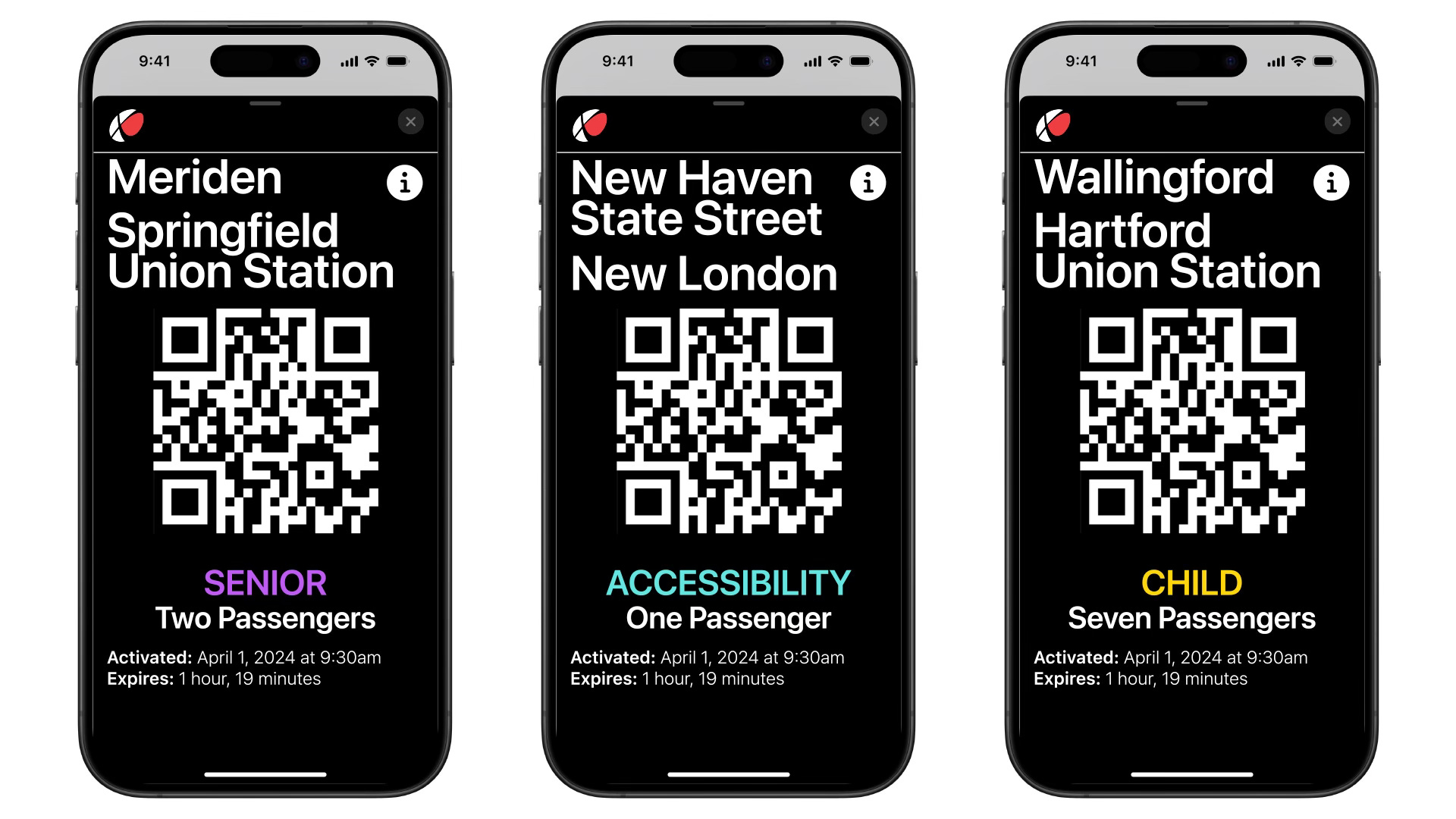
Discounted tickets are available for available for seniors (passengers 65 and up), Medicare cardholders, and persons with disabilities.9 On the Hartford Line, children 2 through 12 years old are also eligible for a discount. The redesign has color-coded the discount tickets to alert conductors that they may have to request proper identification from passengers presenting these type of special tickets.10
Alerts
In the current CTrail eTix app, tapping to view a Service Alert opens up an in-app web browser to either the Hartford Line website or Shore Line East website.11 Up until the most recent app update, tapping to view a service alert opened up the Twitter (currently known as X) feed for the lines; however, a glitch was present that meant only alerts through 2022 ended up being displayed.12 In addition to Service Alerts, the current iteration of the app sometimes displays what it calls Travel Alerts; Service Alerts typically refer to issues at specific stations or on specific trains, whereas Travel Alerts usually relate to system- or line-wide notifications.
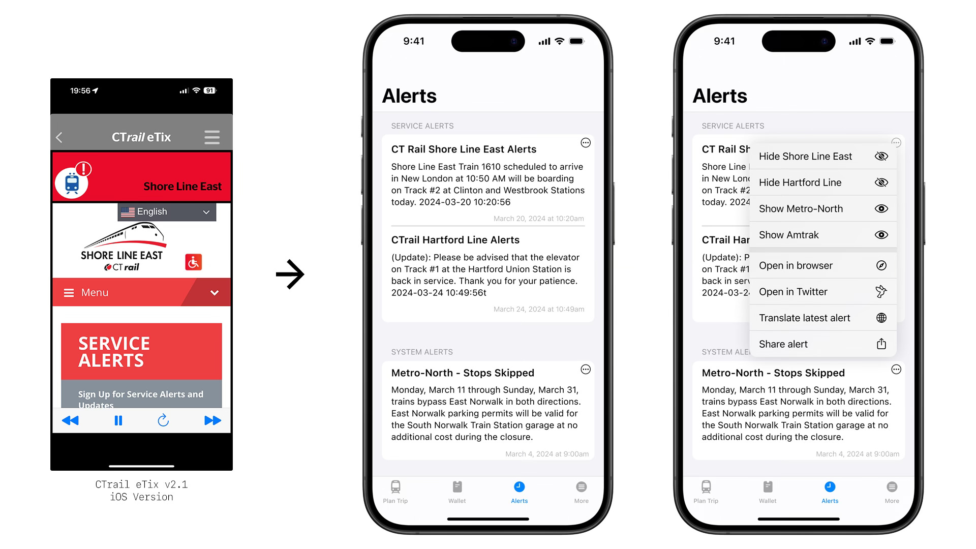
In the redesign, Travel Alerts are rebranded as System Alerts for clarity. The alerts are displayed in the app itself, with no need to open a browser window. This can easily be achieved by a number of methods, but I suggest doing so by converting the relevant Twitter pages into RSS feeds.13 The redesign also proposes allowing users the option of enabling Metro-North and Amtrak alerts, as well.14
Having users remain in-app to read alerts not just saves them time, but also allows for more consistency with the rest of the app. This can also allow on-device translation services to display alerts in a user’s primary language. In the current CTrail eTix app, alerts can be read only in English – despite being advertised that the app also supports Spanish and French.
Home Screen
While the current CTrail eTix app is centered on its home page, the redesign does not.15 In fact, the redesign scraps a home page altogether in favor of having a tab bar at the bottom of the screen. Giving users access to the main parts of the app at almost all times is more efficient than forcing them to return to a home page for functionality.
The MTA’s TrainTime app, used for tickets on Metro-North and the Long Island Rail Road, also forgoes a home screen. The Amtrak app has a home page, but it is almost exclusively used for viewing upcoming reservations; CTrail and Metro-North do not use reservation systems on their trains.
“More” Tab
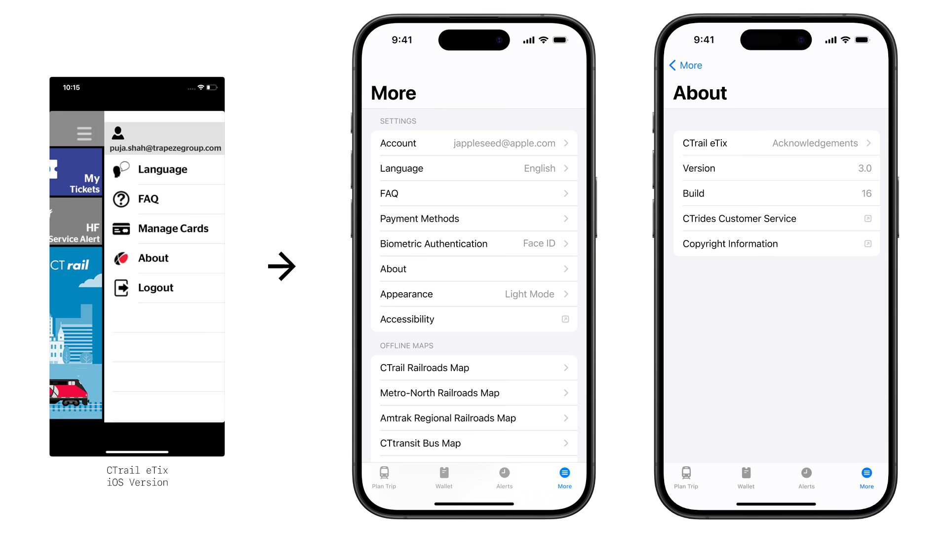
In the current CTrail eTix app, a number of miscellaneous pages and settings are concealed in a hamburger menu on the top-right side of the screen: account settings, language settings, frequently asked questions (FAQ), payment card management, and an about page. In the redesign, various pages and settings live within their own separate sections.
In the redesign, the More tab has two distinct sections: settings and offline maps. Inlcuding offline maps was inspired by the MTA’s official app, and can provide valued information by providing on-device access to high quality images of relevant maps. While I wanted to include an interactive map in the redesign–many if not most transit apps provide one–I decided against doing so, as it would adding one would have been too-involved to have remained within the constraints of this redesign.
The FAQ page, which in the current CTrail eTix app merely opens to in-app browser, is designed similarly to the Alerts tab, with users able to share, copy, or translate the text into the language of their choosing.

Final Thoughts
A mobile ticketing app is far from the most important part of a successful railroad system, but it very well may be the initial experience for riders – even before they leave their homes. Just as a clean train station or clear signage can subtly but crucially improve riders’ trips, so can a well-designed ticketing app.
As one of the most densely-populated states with a history of extensive railroad coverage, Connecticut has advantages when it comes to expanding passenger rail service. Ensuring that riders are able to easily, efficiently, and comfortably purchase and display tickets using their smartphones is an important part of this mission. The CTrail eTix app can and must do better.
There are a number of feature additions that should be heavily considered: an interactive map, Apple Wallet support, push notifications for service alerts, and Live Activity functionality while tickets are active are just but a handful of features that could go a long way to improve the experience for riders.
But the good news is that although the designs I created appear quite different from the current iteration of the CTrail eTix app, almost all of the core functionality remains the same. This means that huge improvements are possible without starting from square one or adding complicated new functionality.
The only service to have a decrease was CTrail’s Shore Line East, which had been the victim of service cuts in 2022. As Jim Cameron, founder of the Commuter Action Group and former chair of the Connecticut Rail Commuter Council, tweeted to me, “Fewer trains attracted fewer riders.”
The arrangement between the MTA and CTDOT to allow New Haven Line-to-CTrail (or vice versa) passengers the ability to make a single purchase in the CTrail eTix app is called “UniRail.” (Passengers to and from CTrail stations and Yankee Stadium can also purchase UniRail tickets.) The UniRail branding appears inconsistently across the Hartford Line and Shore Line East websites, and I could not find any mentions of it within the current CTrail eTix app. The UniRail page on the MTA’s website incorrectly brands CTrail as “CT rail [sic].”
I have taken care to identify the operating system and version number for each screenshot of the current CTrail eTix app. In cases where I do not list a version number, I have used a screenshot from either the Apple App Store or Google Play Store.
In screenshots of the current CTrail eTix app, you may notice ticket types such as “Monthly: APR” and “Monthly Student: APR.” I had no idea what “APR” stood for, and the answer was nowhere to be found on any CTtransit website. Luckily, transit-enthusiast @MichaelSFBA on Twitter pointed out to me that “APR” stood for “April.” While the abbreviation makes sense in retrospect it goes to show that a better design could have enabled the app to list the full name of each month, thus sparing users needless confusion.
My own experience can attest to the current design of the station menu being prone to erroneous selections: in testing the current CTrail eTix app for this case study, even I several times hit “Westport” instead of “Westbrook.”
I thought about adding other stations that are under consideration for CTrail support, but you have to draw the line somewhere. Adding too many purely-for-reference stations would have an adverse effect on usability. For example, adding every stop on Amtrak’s Northeastern Regional, Vermonter, and Acela lines (all three of which run through Connecticut) would clutter up the app. The three stations I mentioned above possess unique qualities that justify including them as reference points.
At the time of writing, Derby-Shelton, Ansonia, Seymour, Beacon Falls, and Naugatuck on Metro-North’s New Haven Line’s Waterbury Branch are the stations that are currently inaccessible. Steps are already being taken to bring these stations up to snuff, so hopefully 100% of stations will be accessible soon.
Every station on Shore Line East has free parking, aside from New London and New Haven Union Station. There are no stations on the Hartford Line that have free parking during the standard work week. Additionally, New Haven State Street Station has no parking lot.
I rebranded the disability-discounted ticket as the accessibility ticket. Having passengers hold up their phone with the word DISABLED in all-caps, colored letters seemed to violate the Centers for Disease Control and Prevention (CDC) guidelines which encourages wording to “emphasize abilities, not limitations.”
Keen-eyed readers may notice that I combined the senior-discounted ticket and disability-discounted ticket in the Plan Trip section, yet they are depicted as separate tickets in the Wallet section. As it currently stands, senior-discounted tickets and disability-discounted tickets cost the same amount of money, so I sought to combine them when users are making a purchase in order to simplify their choices and save screen space. However, having passengers make the distinction is important not just for the collection of demographic information regarding public transit ridership, but also for conductors to assess whether they will need to request identification from a rider.
For some reason, the Hartford Line and Shore Line East have different websites. They also have different user interfaces, display different information, and are generally inconsistent with one another.
Although the update changing the service alerts destination from Twitter to CTrail websites came about seven months ago, it didn’t take effect in my app until I logged out and then logged back in last week. Even the bug fixes on this app are buggy!
The Twitter pages for Shore Line East and the Hartford Line alerts are still updated regularly.
The Twitter pages for Metro-North and Amtrak in the Northeast are also updated regularly.
When I first showed the current CTrail eTix app to my significant other, she found it amusing that the cartoon train on the home page moves in a semi-animated manner. I also enjoyed this, but I could not find a way to integrate it into this modern design. I considered adding in some sort of train emoji Easter egg just for fun, but I ultimately decided that it would constitute too large of a feature change.